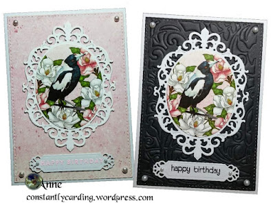
Planning Your Card Designs
Tutorial: Planning Your Card Designs
This tutorial on planning your card designs may help those new to the cardmaking, as well as those who struggle to turn their ideas into reality.
A few extra tips:
Matching colours.
As soon as you've chosen what you want to use as your topper, choose your colour scheme. Unless you're making a rainbow themed design, try to keep your colour pallet to a maximum of three main colours. A card is a small panel to work on and too many colours could overwhelm the eye.Pick your frame.
Try to decide on what size card you want to make early in the design phase. This helps you frame your toppers with more balance. If the card size you want to create doesn't work in with your topper, change it to a different size. As an example, what works well on a 5"×7" card will rarely work on a slimline card, simply because the card base has completely different border scale to frame the feature.
If your topper has an oval-ish or rectangular shape, consider using a rectangular sized card. If the topper is more circular or square, consider using a card base that's either square. And, if you're posting the finished card, check what the maximum dimensions are for your country's postal service. You don't want to be hit with double postage because your card is half an inch too big on one side.
Add something plain.
A basic tip when using patterned papers is to add a solid colour layer between each pattern. This frames each pattern and visually stops the edge of one pattern merging in with another. These solid layers look best at either a one sixteenth inch or one eighth inch thickness.- To make a one sixteenth inch border, cut your solid colour layer one eighth inch larger that your patterned piece.
- For a one eighth inch border, cut your solid layer one quarter inch larger.
Resist the urge to over embellish.
We all love adding extras to our design to get that truly handmade look but overdoing it can ruin a design. Save adding all your bling until last, using it to enhance your topper rather than bury it. Too much of a good thing can again overwhelm the eye. Consider using the extra bling to highlight certain areas or add the extras in sets of three's for a more visually balanced look. If you want to use lots of bling, make them your topper at the start.Don't forget, if you have any questions or problems, please reach out and leave a comment below. We will will reply as soon as we can. Or, if you're a little shy, you're welcome to contact us using the contact form for a more private chat via email.


Comments
Post a Comment